When it comes to tile, one of my favorite things to talk about is COLOR. I love pulling together color palettes and I love watching color trends evolve over time. And we’ve seen, based on your Insta feeds and lifestyle blogs, that many of you do too!
In this part of our Luxury Design series, I’ll walk you through a few things you might want to look for in terms of color when you’re selecting your tile.
Cohesive Collections – With Mutina materials, we love how tiles from one collection can be paired with other materials from that collection, and with those from other Mutina Collections. This is especially helpful when you’re designing more than one room of your home and want each room to be different, but you want it all to tie in seamlessly. There’s a lot to be said for a group of designers who make this cohesion possible through thoughtful design intent.
Neutrals – Sometimes having the right color is about having no color at all. These are the spaces that call for the perfect blend of neutrals such as earth tones, terracotta, or shades of black, white and gray. When you’re evaluating tile color, first of all – and I can’t stress this enough – order a sample. Look to see how the neutral shade works with the other hues in your space. If not the perfect white or gray, the tile can look too green or pink. But the right tile will fit your project like a glove (or better yet, like the perfect pair of Lulu’s!).
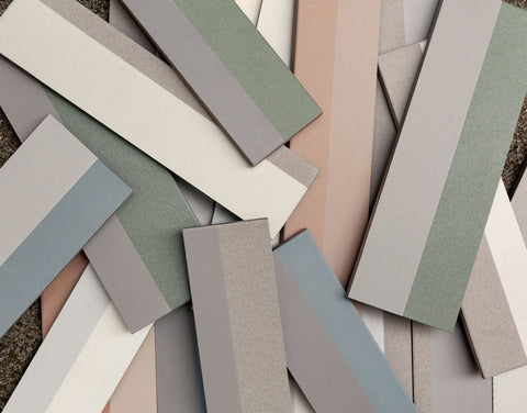
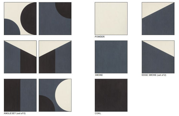
Palettes – When you discover a collection that incorporates several colors into one tile – voila! Your entire palette is instantly set. You’ll get this luxury when you choose tiles like Puzzle or Piano. Because we trust the color expertise of the Mutina designers, we know we can let these tiles set the palette for any space.
( Mutina | Puzzle | Anglesey
Nuances – When done well, subtle color nuances in a tile represent the epitome of sophistication. This approach to design gives each tile a hand-crafted feeling, which is perfect for modern homes and farmhouse projects alike. Check out this tone-on-tone look created with Mews. We know how much design exploration went into getting this just right. There are lots of me-too’s out there now, and none of them capture it quite like this.
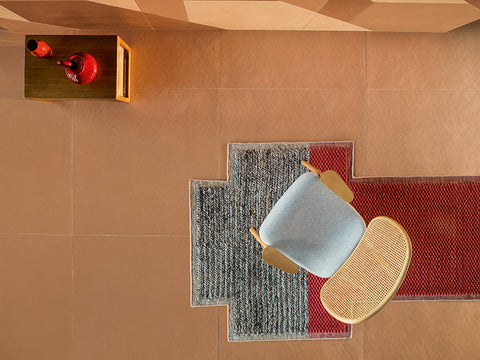
Vision & Trends – The designers of the Mutina Collections are known for not only identifying color trends, but establishing them, as well. When you think of terracotta, for example, one might call to mind a traditional design sensibility indicative of the Southwest. But designer Patricia Urquiola had a design vision for this traditional material that would bring it into harmony with modern design. See how she used terracotta – both the material and the color – in her architectural projects:
- Room Mate Hotels In Giulia and Milan, where terracotta is blended with shades of pink, green and blue for a vintage touch.
- We’re also going gaga over the bronze and walnut aesthetic in the Patricia Urquiola-designed Luxurious Hotel Il Sereno on the shores of Lake Como.

(Mutina | Tierras | Industrial Sand)
Get Patricia Urquiola’s signature style with her collection of
Tierras
tiles. (And speaking of color, consider using a colored, contrasting grout to really make it pop!)
Explore all of our Mutina Collections


